Personal /
Editorial
TIMBER - MAGAZINE
The magazine "Timber" explores the issue of whether architecture should focus on the functional aspect or the aesthetic through various articles.
my goal was to design an engaging visual experience that would captivate readers while allowing content to breathe. Central to this vision was the strategic use of whitespace - a deliberate choice aimed at enhancing readability, guiding focus, and fostering a sense of sophistication within the publication. The skeleton of the magazine is built up on a flexible 12x12 modular grid system. Acumin pro (Sans serif) and Minion pro (Serif) was chosen to create a well paired typographic expression.


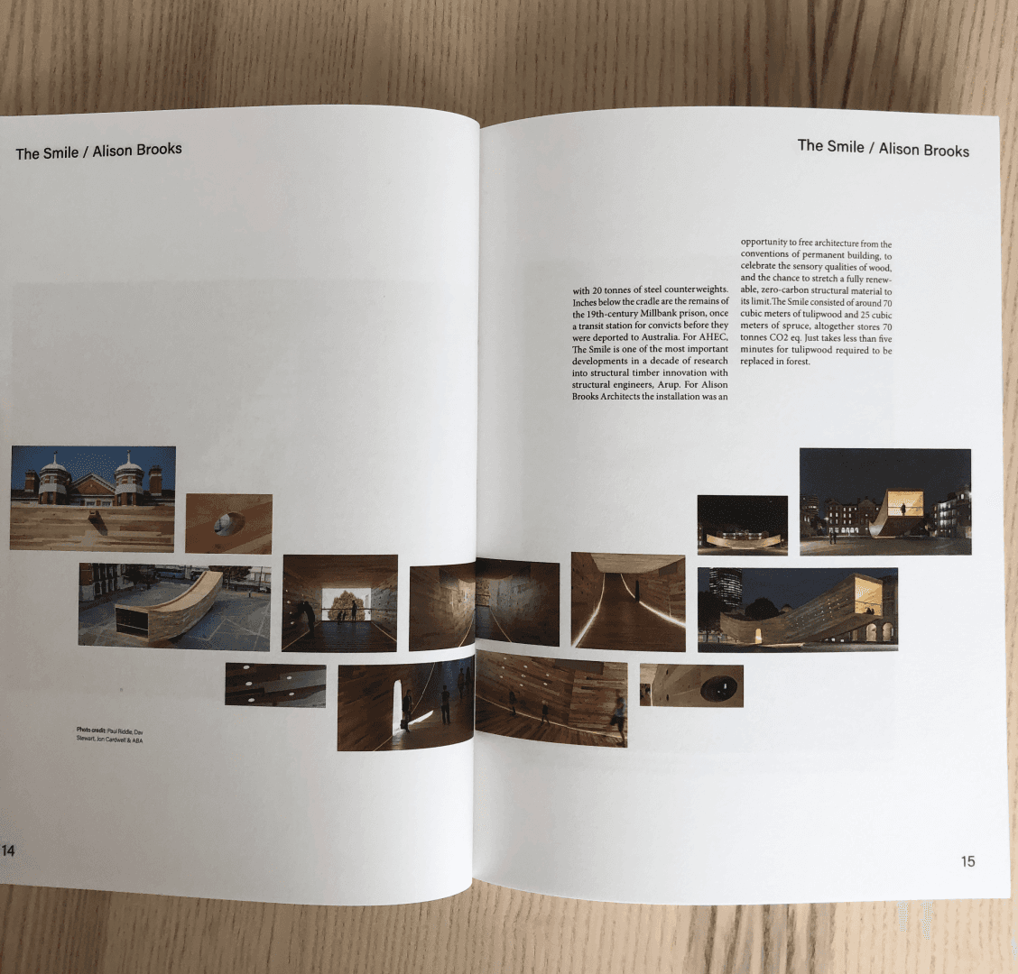
“A compromise between functionality and aesthethics may become necessary.”